Showing posts with label restaurant graphics. Show all posts

Thursday, September 22

Peek Into 715

Lawrence, Kansas » Mass Street
--------------------------------------------------------------------
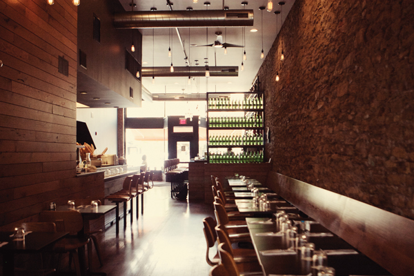
This is just a really beautiful restaurant. From the metal chairs on the patio which were super stylish and comfortable to the naked light bulb fixtures in the dining room, there is a lot of attention to detail and style. Pots of fresh rosemary on the window sill and a basket filled with loaves of fresh bread at the open chef's window are two cues that there is thoughtfulness to what is being served. A wall of green water bottles separates the bar from the dining room and brings to mind the jugs of wine at Macaroni Grill, where I once hostessed, but done it in a much, much nicer way. I like how the repetition of design elements and clean lines draws you right into this long space. And the hidden bonus is their cellar kitchen downstairs. We sat on the patio and there is so much going on on Mass Street, it's constant entertainment. We did a restaurant snapshot of 715 a couple of months ago, and you can read it again here.

Thursday, September 8

Peek Into Tower Tavern

Kansas City, Missouri » Martini Corner
--------------------------------------------------------------------
This neighborhood sports bar, part of the Martini Corner family, is a regular hangout for many sports fans. Grant and Damian sponsor softball and kickball teams and mementos of their achievements are part of the decor. Damian says they like to keep it simple; for the most part, their decor consists of fun pieces from the beer and liquor companies.

All the shelving and metal work throughout the bar is the work of Aaron Ray. "He was a friend of a friend, who did a lot of different metal work before (custom motorcycles and other metal fabrications)," owner Damian King said. "We were not necessarily looking for metal, but we knew we wanted something unique and thought this fit the building well. It is certainly one of a kind."

Both the Red Bull Tower Tavern sign and Budweiser beer can mobile are promotional items provided by the companies. Vintage-looking, Pabst and Schlitz-branded lighting line the west wall of the bar with a shelf of retro beer cans above them. The beer collection belongs to a friend. "We thought the retro look of the cans helped enhance the history of the building," Damian said. "The building was built in 1900 and the old-style beer fan were a nice fit. We like to keep the walls fairly neat and clean, the cans were subtle enough but added some color and texture."

Thursday, August 11

Restaurant Graphics: BRGR

This photo provided by Intentio/Tara Pederson.
Prairie Village, Kansas
--------------------------------------------------------------------
Art Direction, Design & Copywriting by: Tara Pederson
--------------------------------------------------------------------
 ---FONTS & LOGO--- 
"The logo concept is retro, modern feel. Retro with the staggered boxes and modern with the Gotham font (created in 2000). The PMS colors in the logo are 1815 and 497. (For the menu), we used Bodoni bold and poster for section headers and Gotham regular and bold for items and descriptions. The brown and red colors match the colors used in the logo. 

 ---PAPER+PRINTING--- 
We chose French Paper - Speckletone, Oatmeal for the menu paper because of the natural look and feel. More importantly it's 100% recycled paper and French uses hydroelectric power to make the paper. The printing is 4-color digital printed at a local printing company. 

 ---INSIDER INFO--- 
I was responsible for the branding, art direction, design and copy. I have a small studio called Intentio Branding + Design in Colorado, however, I am moving to Kansas in just a few weeks to work for Bread & Butter Concepts, the parent company for BRGR Kitchen + Bar, Urban Table and Gram & Dun. I covered the naming, logo design, branding, messaging themes, advertising, social media, website, public relations, signage, uniforms, packaging, menus, any marketing piece you've seen relating to BRGR. Two things that I love about the BRGR branding project are the bathroom stall names and the kids' menu chalkboards. It's great to work with a restaurant owner that lets you make fun design decisions. Currently, I do all the menu updates from Denver and get them printed locally (in Kansas City). I will be a local very soon and looking forward to it!"
{Tara Pederson} 

 ---AWARDS+ACCOLADES--- 
BRGR Kitchen + Bar was named 2010 "Best New Restaurant" from KC Magazine and both "Best New Restaurant" (readers' choice) and "Best Burger" (editorial choice) in The Pitch's "Best of Kansas City" awards. You can read more press here.
--------------------------------------------------------------------
Interiors by Realm Architecture

Thursday, June 30

Restaurant Graphics: Genessee Royale Bistro

Kansas City, Missouri
--------------------------------------------------------------------
Art Direction: Brady Vest
Design: Jenn Rogers
--------------------------------------------------------------------
 ---FONTS--- 
"In addition to the modified  lettering for the word "Royale", we used Helenic and Trade Gothic and a nice typeface with a ridiculous name called Darling Nikki for all of the Prince fans in the audience. 

 ---PAPER+PRINTING--- 
We used chipboard for the main lunch and dinner menu graphics. Chipboard is an industrial grade recycled board. The other papers are French Durotone and other various other scrap papers for small temporary menus we have printed for them. We contacted Dan Brewer at Arbuckle Signs to hand paint the logo on the window - that's right, hand painted, not vinyl. We wanted it to be as authentic as the older sources we were pulling from and it turned out perfectly imperfect. 

 ---INSIDER INFO--- 
When we were asked by Todd and Tracey to develop the logo and identity work for their new restaurant project - Genessee Royale -  we were thrilled. We have been huge fans of Happy Gillis and were excited to be a part of their new restaurant. They gave us very little specific guidelines, other than the fact that it should have some aesthetic connection to its location in the West Bottoms and that it was going to have a subtle nod to French Bistro as well as some color directions.

We began to look at older sources for the logo references such as hand painted signage from small town cafes to gold leafed signage in authentic French Bistros. We tried to keep the crown as a connection 
to the West Bottoms, the American Royal, etc. while not making it too central to the logo."
{Brady Vest} 

 ---AWARDS+ACCOLADES--- 
See their press archive here. It's a big and impressive list that includes representation in design, wedding and home decor publications, a healthy presence in the blogosphere and chosen as one of the best rock posters "of all time" by Billboard.com.
--------------------------------------------------------------------
Hammerpress has an AWESOME store on Southwest Boulevard. Brady is engaged to Lindsay.